JBU Honors Program T-Shirt Design
I designed two T-shirt designs for a local farmer's market, created for the purpose of screenprinting with no more than three colors.
Sketch Progression
I developed a few pages of sketches for this design, most of which I have since lost, but I have a few of my final favorite sketches featured to the right. I landed on the idea of having the claw interact with the baseball gear in an engaging way, such as clutching a baseball bat or gripping a ball. I also considered having it interact with the name, perhaps curling around the limb of the capital "T."
I really wanted to put any hand-lettering skills I had to use here, but as I am not an expert in baseball lettering or fonts and was working on a budget, the best I could get was a rough sketch, featured below. I ended up purchasing a font that came pretty close to the vision I had in mind - stylized and cursive, but readable and not too elaborate. I liked the distinct capital "T" that could be - and eventually was - used as a standalone initial.
I sent these sketches over to the team members, and they declared the talon gripping the ball a winner.
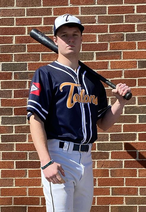
Design in Action
I initially only handed over one version of the logo - the claw holding the baseball, which depicts the team name - but I ended up going back to this design and adding several variations and secondary marks as needed. The team ended up primarily using the claw alone or their lettered name on their jerseys and gear, and the full logo was featured on social media, merchandise, and any other promotional content. I also gave them the single capital "T" from their logo to embroider on baseball caps.
This project was a bit out of my comfort zone at the time since I had not worked extensively with logos and logo variations at this point in my college career, but I gained a lot of confidence from getting to see my design used so extensively in several different ways. I learned the importance of variation and secondary marks in brand design, and I'm definitely still really proud of this project. This was a really fun design to create as a baseball lover.


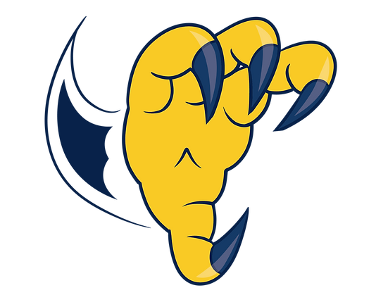


Talons Baseball Logo Design
CLIENT: JBU TALONS BASEBALL TEAM
WORK DONE: ILLUSTRATIVE LOGO DESIGN
I was commissioned by the intramural baseball team at JBU to design a logo for their gear and other promotional events. While I love tackling logos, I had never designed a sports logo before, so this was a new challenge for me. I had to consider JBU's existing branding, competing team logos, and sports marketing in general.
JBU's current mascot is Regal the Eagle, so the baseball team appropriately named themselves the Talons. I got to work studying the colors and designs that JBU used to promote their athletics, and I was directly inspired by an old T-shirt design they once used that I have since lost. It featured a stylized claw that I really liked.
With a simple color palette in mind and a vision for an engaging and impactful logo, I got to work on the sketches.