JBU Honors Program T-Shirt Design
I designed two T-shirt designs for a local farmer's market, created for the purpose of screenprinting with no more than three colors.
2021 Honors Program
T-Shirt Design
CLIENT: JOHN BROWN UNIVERSITY HONORS PROGRAM
WORK DONE: VECTOR T-SHIRT ILLUSTRATION
Having done the T-shirt design for JBU's Honors Scholars Program the year prior, I was happy that the executive council reached out to me again in 2021 to create a new design. I was a bit more pressed for time at this point in my college career, since it was my senior year, so I had less time to thumbnail, sketch, and experiment, but I still produced some designs that I am proud of.
I ended up turning over four different designs (with possible variations within the designs) to the council, and spoiler alert: they did not pick my top choices, which is perhaps my own fault for having designs that did not feel of equal value to me, but c'est la vie. I still wear the design with pride, and the designs that were not chosen were still made into stickers. It was a fun project that I was happy to include in my portfolio and may be incorporated elsewhere in the future.


Conceptualizing & Sketching
As aforementioned, I did not quite have the luxury of time as I did with my 2020 T-shirt design, so I spent less time thumbnailing and sketching as I normally would. A lot of the ideas I had seemed to manifest better in Illustrator than on pencil and paper beforehand.
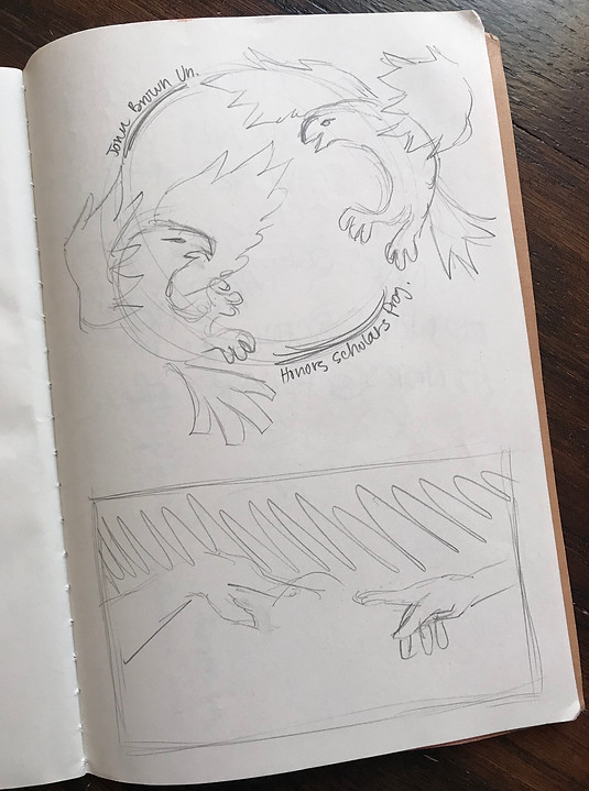
I knew I wanted to incorporate the same colors in the Honors logo as I had the year before, and I needed to include two lines of text, both "Honors Scholars Program" and "John Brown University." I definitely wanted something that was text-only and something that was more illustrative, probably featuring eagles (our mascot), references to classical academia, etc. I studied Pinterest and TikTok for some inspiration and threw some loose sketches together before diving into Illustrator.

Ideation & Inspiration

The first design I created was text-only, like I had wanted, and ended up being one of my favorites. I used a clear, sans-serif typeface and stretched and warped it to my heart's delight, as graphic designers are forbidden from doing. I used a variety of colorways and gradients to nail down the exact look and feel of the design, and gave it some sparse texture throughout the lettering.
In my second design I played off the idea of eagles, working with a vector image I had purchased several months ago to create a simple scene of two eagles in mid-air. I love circular designs on T-shirts, especially in the design from 2020, so I hoped to pull that back in with this design.
The third design I created is probably my favorite - it features a fun, cartoony eagle based loosely on a whale illustration by another artist. I enjoyed mixing and matching the colors to get the best look, and I think the repetition of the vine from the original logo and last year's design pulled it all together. I really wish this one had made it, but it might have been lacking some sense of professionalism.
My fourth design, the chosen one, was a nod to classical academia, since it featured the hands from Michelangelo's Creation of Adam. I originally wanted to place something between their hands, like an open book or a pen or a reference to intellectualism, but I somewhat liked the simplicity of the hands, and so I left it. In retrospect, I was glad I made this decision.


Final Approved Design
Once I had finalized and sent over my designs, I learned that the council had decided to scale down and place the design in a left breast-pocket position, which made me nervous for the integrity of my work. The design they chose in particular felt a bit too delicate to scale down, but it ended up turning out fine, as long as the shirt isn't over-washed and ruins the fine lines. In retrospect I wish I had added some more clarity to my work so that it didn't feel too anemic at such a small scale, but since it was one color and relatively simple, I did end up liking it a lot. I think it would be neat to also have it on the back of the shirt at a larger scale, but alas, budget.
Budget was a big factor of which design was chosen. Initially I was told anything flies as long as it contains the necessary text and stays within about three or four colors. I adhered to this strictly, but ultimately, the design that was the most successful in one color won out. I wish that I had rendered everything else as one color as well!
Regardless, the importance of communication was not lost on me with this project, and I am still happy with the work I produced and the ability to share it with others. Seeing my designs on T-shirts is a special kind of thrill for me because not only is it tangible, but it's practical and serves a specific purpose. I am happy that the Honors executive council thought of me for this two years in a row!